LENS TEST EXAMPLES
PRELIMINARY TASK
FINAL PRODUCT
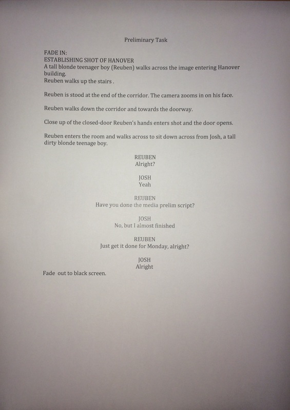
SCRIPT
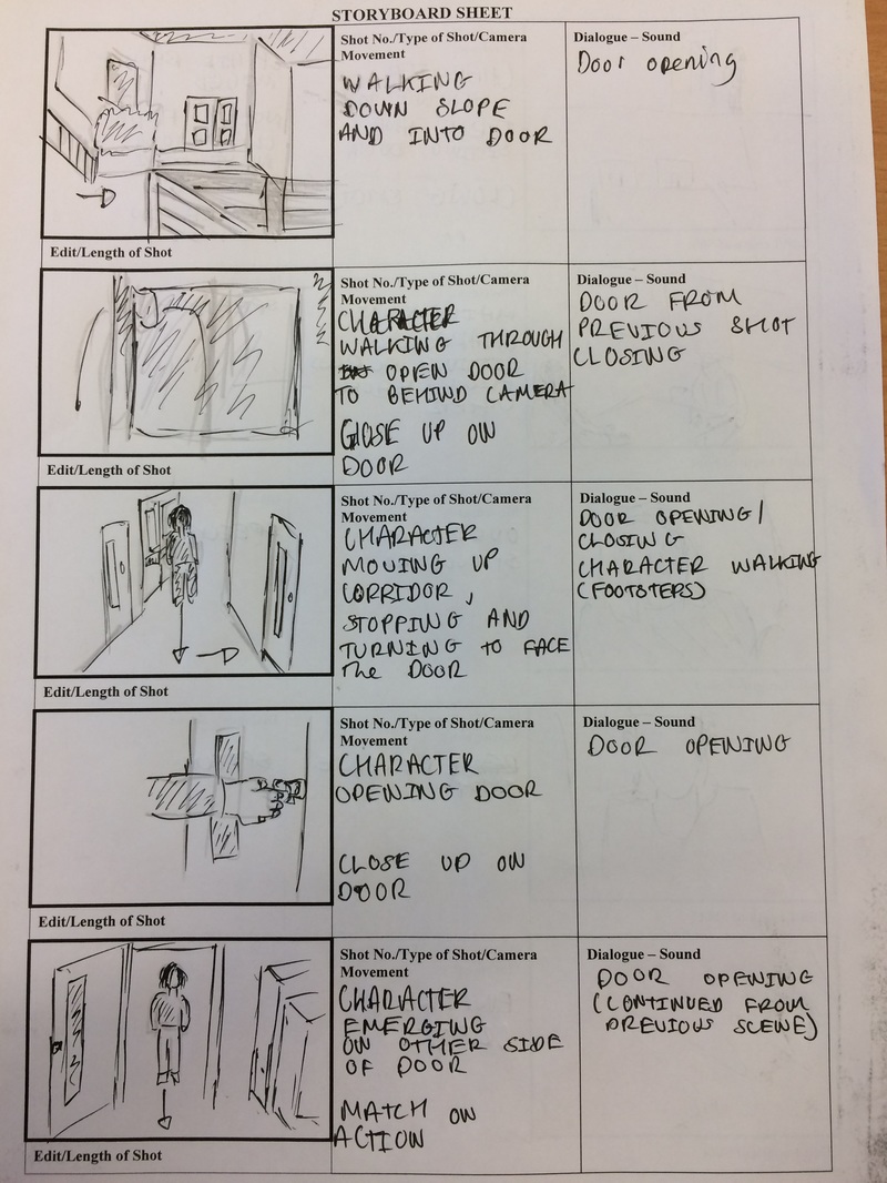
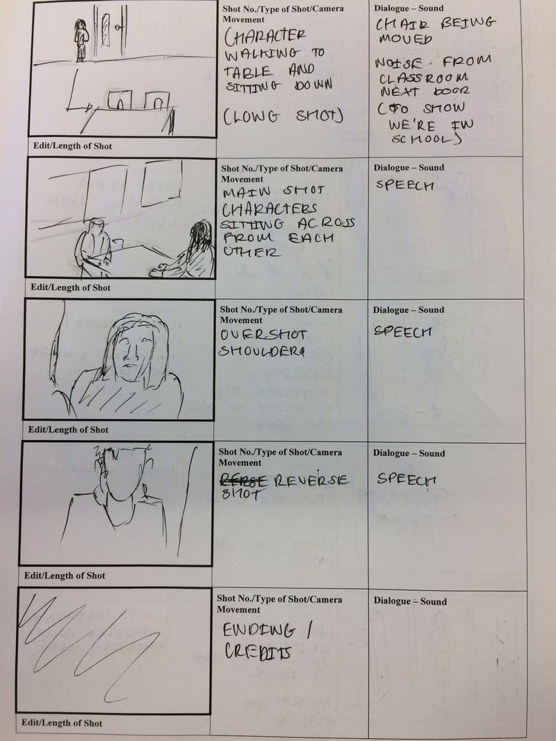
STORYBOARD
|
|
EVALUATION
Overall, I feel that we did relatively on our preliminary task as a first piece, however there are definitely some elements that in hindsight I would have done differently.
The first would be the camera wobble whilst Reuben is walking down the corridor towards the camera. This was mainly due to the lens being a little stiff, however there are things that would minimise the effect, the main one being to have the shot slightly more zoomed out and instead have the camera placed a little closer to the action. I could also simply have steadier hand, but due to this being my first time filming I was a little unpolished.
The first would be the camera wobble whilst Reuben is walking down the corridor towards the camera. This was mainly due to the lens being a little stiff, however there are things that would minimise the effect, the main one being to have the shot slightly more zoomed out and instead have the camera placed a little closer to the action. I could also simply have steadier hand, but due to this being my first time filming I was a little unpolished.
RESEARCH AND PLANNING
TYPOGRAPHY
|
Typography - The art form of using fonts to express something.
Black Mirror - The logo suggests that the TV show is quite dark and edgy, with the crack implying that things are being changed an distorted as well as the fact that breaking a mirror leads to seven years bad luck. The name itself also implies that it is reflecting a different world, as mirrors are not normally black. Game of Thrones - The logo implies that the series is set in old times, and it looks like it may even be carved in stone. The 'T' in Thrones acts as a division between the two halves of the logo, perhaps suggesting to the division between the families in the show. The lines in the 'O' also hark back to an older time, as these lines were once used to differentiate letters from numbers. The Walking Dead - The letters are worn and faded, which imply that, which is why the font is very bold. The distressed nature of the logo also suggest the setting of the show, and represents how both the characters and zombies are wearing away. The name itself suggests that the show is about a zombie apocalypse, which may draw in potential viewers. Berserk - The font used in the logo is very chaotic, and along with the name of the show suggests that it is likely to be quite action packed. The logo also appears to be drawn out of blood, which again suggests to the chaotic nature of the series but also implies that it might be quite dark and mature. The 'S' also acts as a division between the two halves of the word, as it resembles a jagged line, and could represent the split character of the protagonist, Guts. |


|
Helvetica - Helvetica is a very common font used by hundreds of brands to create their logo, as it is simple and easy to read. It is also a very versatile and can be used to create a variety of effects in terms of a logo, and although it is a Mac exclusive font it is even used by Microsoft and many of its subsidies for their logos.

|

|

|
GENRE
Genre is all about our need to classify and label the materials available to us. It allows us to quickly categorise and select the different forms available to us.
These include, in film:
- Horror
- The Thing (1982)
- Sci-Fi
- Alien (1979)
- Comedy
- Hot Fuzz (2007)
- Romance
- The Wind Rises (2013)
- Thriller
- Se7en (1995)
- Indie
- Hardcore Henry (2015)
- Action
- Die Hard (1994)
- Adventure
- The Princess Bride (1987)
- Fantasy
- Pan's Labyrinth (2006)
- Rom-Com
- Scott Pilgrim Vs The World (2010)
- Documentary
- The Bridge (2006)
- Drama
- Apocalypse Now (1979)
Genre is flexible and malleable. Film therefore requires factors that can be judged in order for us to identify them.
Conventions - Conventions are the parts of a film that determine its genre.
Codes - A code is a set of determiners that we as an audience 'read'; it is a set of signs that carry meaning.
OPENING SEQUENCES
|
Westworld:
Westworld's opening sequence is very abstract in its appearance. The fact that everything is being constructed in white represents both a purity and innocence as well as an atmosphere of death. The detail that is being created in the robots, such as the tendons and the iris, suggests that a great deal of care and attention has gone into the robots, and that they are perhaps a labour of love by the creator. The robots then begin to leave the piano, although it continues to play and the keys are being pressed down. This implies that human input is becoming more and more unnecessary as the robots become more intelligent, and suggests that they are likely to go rogue. A gun is then introduced into the sequence, and suggests that violence is likely to be introduced into the show, and creates tension before the opening sequence has even ended. |
|


|
Stranger Things:
The colours used in the opening of Stranger Things are specifically chosen to represent certain themes, as the black represents death and the unknown, whilst the red hints to both anger and danger, which are both key elements in the show. The shapes also seem to be random and irrelevant at the beginning of the sequence, but eventually come together to form recognisable letters, and then finally form the title. This represents the mystery that occurs during the show, as although the initial clues make little to no sense, eventually they come together to form a a full story. The fact that the title itself is made out of neon and is in that specific font is also intentional, as it harks back to the 80s when the show is set and is trying to emulate, as neon business signs were particularly common and that font was used in many Spielberg films. |
|


|
Power:
The opening sequence to Power begins with a skyline of New York, which due to its recognisable appearance immediately sets the scene for the show without any dialogue or exposition. It then cuts to an image of a ring, which suggests that the lifestyle depicted by the protagonist of the show is very luxurious, yet the fact that a dissasembled gun appears in the very next shot suggests that it is also an incredibly violent and dangerous lifesetyle. The chess pieces imply that the life of a New York drug kingpin is very tactical and strategic, and each move made must be carefully considered in order to not end up either dead or in jail. The lipstick merging into the high caliber bullets is a combination of the rest of the themes portrayed in this sequence, as the lipsticks represents both the sex and the luxury lifestyle, whilst the bullets again imply the frequent use of violence. |
|


|
The Crown:
The Crown begins with the gold ore as the focus of the shot, and we witness the gold being extracted from the rock and beginning to form shapes. It then gradually becomes more and more complex and creates more intricate details as the gold begins to form a crown, although the camera remains very close and pans frequently in order to prevent the audience from seeing the full creation. As more details are created and the object becomes recognisable as a crown, until we are shown a slow panning sillhouette of the crown, with the iconic iron cross perched on top. However, the image of the gold running has symbolism of blood through veins, which suggests that the royal family have literally gold blood. |
|


|
Coraline:
Coraline begins with the title card, which is opposed to many other opening sequences, although the first 'real' shot is that of a tattered doll being plucked out of the night sky by pseudo-skeletal, apparently robotic hands, and is placed down on a work surface complete with specialist tools. However, the doll begins to be disassembled in a series of paticularly brutal shots, such as having the hair ripped out of the scalp, the eyes plucked out, and the stuffing being violently pulled out and then re-stuffed. The music then shifts however, and as the hands reassemble the doll much more care is taken as the buttons are selected, new hair is put in and new clothes are sewn. Finally, the doll is released out of the same window it was taken from and floats away. The fact that the hands in the sequence are so violent to begin with before taking much more care suggests that there was a paticular hatred for the original doll, and the fact that the new creation is so treasured has heavy themes of death and rebirth. |
|


INITIAL IDEAS
Feedback:
We were told that the actual idea for the film had a lot of potential and included a lot of worthwhile ideas. However, we also need to work on finalizing the plot of the film, as our idea is currently lacking detail and the story to tie the whole thing together. In response to this our group discussed our idea further, and ended up finalizing the plot for our thriller.
Presentation:
Mind Map:

CONTINUOUS SHOOTING/LONG TAKES
Definition:
Continuous shooting (otherwise known as a 'long take') is a filming technique that can be used in several different ways. One aspect is to simply have long takes, often involving the use a steadicam rig to immerse the view, with takes sometimes lasting several minutes, such as Alfonso Cuaron's 2006 film 'Children on Men'. Films can also be filmed entirely in one take, which is a rarer aspect of the technique due to the sheer complexity of its execution. However, there are still many notable films shot in a single take, such as the 2002 film 'Russian Arc'. More common than this however, is the editing together of many shorter takes to create the illusion of a single take, notably occurring in Alejandro G. Inarritu's 'Birdman' (2014).
Origins:
The first film to use this technique was Alfred Hitchcock's 1948 thriller 'Rope'. Initially intended to genuinely be shot in a single take, complications developed when the size of a film reel necessary to shoot an entire feature length film on was not available. Instead, Hitchcock decided to shoot in ten minute takes, as long as was possible, and instead hide the edits by zooming in on a dark surface before continuing the scene. Therefore, the film only consists of ten shots, and although not a perfect film, the idea is an interesting experiment that was not attempted again for another 50 years.
Our Usage:
We have decided to shoot our horror using a long take style in many parts throughout our piece, inspired both by 'Rope' and also survival horror video games, such as 'Silent Hill 2' and 'Resident Evil 4'. However, we felt that the technique's use was limited in horror movies, as even films from a first person perspective, such as 'Rec' and 'The Blair Witch Project' still crossed greater periods of time and contained 'traditional' cuts. We felt that the usage of continuous shooting in a horror movie could serve to immerse the viewer and thus increase the film's impact.
GENRE CONVENTIONS
We took note of many of the more significant horror movie tropes and conventions whilst developing our piece, and at times decided to embrace them, at with others attempted to avoid them at all costs.
Location:
We found that the location of a horror movie was not a convention that could be easily sidestepped. Traditionally, horror films are set in isolated places to create an atmosphere of desperation, although there are exceptions, such as 'The Exorcist' (1974). However, it is much easier to create fear and tension when the central characters are stranded. Because of this, we felt that setting a balance between the two was ideal, and decided to trap the protagonist, but in his own home that was therefore familiar to him, and not inherently terrifying.
Lighting:
Similar to the location, it is hard to create tension in a horror movie without the appropriate use of lighting, and most horror movies set in daylight tend to be zombie movies, such as 1980's 'Dawn of the Dead'. When using dim lighting, it allows both the character and the viewer to worry what is in the darkness, and potentially see things that aren't there at all. Therefore, we consistently use dim lighting, or no lighting at all, throughout our entire piece to again create the appropriate atmosphere.
Characters:
Horror movies often suffer from repeated characters across the genre (the jock, the blonde, the stoner) and more often than not appear particularly frequently in slasher movies. These characters can sometimes give the viewer a relatable and familiar character straight off the bat, but the characters tend to meet the same fates across several different films. Due to the fact that these tropes have been used in hundreds of films before, we decided to avoid them and instead create our own character, instead settling on an upper-middle class man.
Jump Scares:
Horror movies have a tendency to use what is known as a 'jump scare', often at frequent intervals. This is often due to the fact that it is easy to get a reaction from a sudden movement or loud noise due to human nature, and can often fool the audience into thinking that they have been actually scared, not simply played a loud piece of music. Horror movies are also an easy method of releasing the tension built up throughout a scene, notably used recently in the 2012 film 'Woman In Black'. Because of how frequent jump scares are used in horror films, and how they are often a cheap attempt at audience reaction, we felt that our film would have a much better pace and tension if we did not use any jump scares, instead allowing the atmosphere to build continuously throughout the piece.
CHARACTERS AND ACTORS
William Maitland-Round: Protagonist
We chose Boris to play the protagonist as he was the only one in our group with any acting experience. He also fit the role quite well, as he was able to do the appropriate accent convincingly and also owned a bathrobe.
We chose Boris to play the protagonist as he was the only one in our group with any acting experience. He also fit the role quite well, as he was able to do the appropriate accent convincingly and also owned a bathrobe.
CONTINUITY
We took a great amount of care whilst filming our piece to avoid running into continuity errors, as they are easy to miss whilst filming and can lead to a viewer losing immersion in the film. The fact that there were multiple people on set whilst filming helped us to avoid them, as we were simply more likely to spot them. We took care to ensure that lighting remained the same, and that shots didn't jump around between cuts. We also took care in ensuring that Boris's costume was the same throughout, as even something as simple as the robe being re-tied differently could be easily spotted by a viewer. Many notable films contain continuity errors, such as 'Jurassic Park' (1993) with the sign's arrow as pictured. Ridley Scott's 'Gladiator' (2000) is infamous for containing many continuity errors, such as denim jeans appearing underneath costumes and watches appearing that didn't exist in previous shot.
|


|
GENRE SEQUENCE
I've chosen to analyse the 'blood test scene' from the 1982 horror classic 'The Thing' directed by John Carpenter. In my opinion, this scene is a near perfect example of how tension and release can be used to immense effect, without relying on a single jump scare. This element was something that we attempted to emulate in our piece, as often the fear of being scared is much more powerful than the act of being scared itself.
The sequence begins with MacReady (Kurt Russell) testing the blood of each of his companions with a hot wire to ensure that they are not the 'thing'. Tension builds as crew members are cleared one by one, with the viewer knowing that the inevitable is only coming closer. Carpenter even gives you a red herring, with with Garry's (Donald Moffat) premature dismissal of the method, leading the audience to believe that he therefore must have something to hide. However, whilst the viewer is still assuming that Garry is the antagonist, Palmer's (David Clennon) blood begins to run and he begins shaking uncontrollably, confirming that he is the shapeshifter. Another cause of tension begins, as Palmer is tied to the other crew-mates, creating a timer of sorts for MacReady to work the flamethrower. Finally, Windows (Thomas Waites) is grabbed by the monster and the practical effects create a gruesome body horror scene, allowing the tension that has been built up to be released.
This entire sequence is incredibly effective due to the fact that there are multiple 'layers' to the tension, therefore not allowing the audience a single break throughout the whole sequence until Windows is grabbed. Thusly, Carpenter causes the viewer to genuinely worry for characters, also due to the previous character development throughout film. The red herring is also very well used, as it is placed in just the right place so as to keep the audience distracted whilst thinking over it, and the begins the horror.
Overall, I feel that this sequence uses tension and release incredibly well, and to a truly terrifying affect. This technique therefore became a big influence for our short film, due to its effectiveness in scenes like this one.
CHOOSING OUR SETTING
We decided to use Boris's grandparent's house for two main reasons, the first of which being the fact that it fitted the character we wanted excellently. We were aiming to have an upper-middle class protagonist trapped in his own house, therefore this fits perfectly. Its age as well (Georgian era) also adds to the story , as the establishing shot shows it as a truly haunting location, particularly when just one or two windows are lit up.
The other main reason to use the house as our set was the ease of access due to it belonging to Boris's relatives. They were also on holiday whilst we were shooting, which gave us free reign over the set without the risk of disturbing anyone, particularly as we sometimes filmed quite late at night, especially during the later part of the shooting schedule.
The other main reason to use the house as our set was the ease of access due to it belonging to Boris's relatives. They were also on holiday whilst we were shooting, which gave us free reign over the set without the risk of disturbing anyone, particularly as we sometimes filmed quite late at night, especially during the later part of the shooting schedule.
AUDIENCE PROFILE
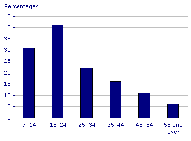
Every media piece of media attempts to target a specific audience, usually based on either gender or age. We decided to aim our film at an age group rather than a specific gender, in particular people aged 17-30. We felt that these would be the people most likely to enjoy our film due to the fact that older generations don't tend to enjoy horror movies as much as younger viewers, due to the fact that they often have a sense of 'one-up-manship' between each other, as to who is least scared by the action occurring on screen. Older audiences are more mature however, and are thus less like likely to have this same 'competition'. However, older people do still watch horror movies, just simply make up much less of the total audience than people younger than 30.
We have attempted to attract younger viewers by taking inspiration from more modern horror movies as well as survival horror games like 'Silent Hill 2', which people over 30 are less likely to have played. The inspiration is shown in the camera angles used throughout our piece, particularly the third person continuous shots following the protagonist.
We have attempted to attract younger viewers by taking inspiration from more modern horror movies as well as survival horror games like 'Silent Hill 2', which people over 30 are less likely to have played. The inspiration is shown in the camera angles used throughout our piece, particularly the third person continuous shots following the protagonist.
DECISION MAKING PROCESS
- The news reading was used to open our piece as we figured that it would give context into the crime that was hinted at in our piece. Before it was introduced the plot was a little hard to follow and it was generally unclear as to what was going on throughout the piece. Therefore, the introduction of the broadcast details the murder that took place in the house and thus gives context to the film.
- We decided to use Boris's grandparent's house as our location due to ease of accessibility, as they were not home during our filming schedule, and also due to its old and slightly daunting aesthetic, which fit the ideas for our film perfectly. It was also large enough to give us multiple options in terms of where exactly to shoot, including a selection of rooms and plenty of long corridors.
- This exact part of the house was chosen to shoot in due to the fact that, although it wasn't the most spacious corridor available, it did have a large amount of offshoot rooms, giving us plenty of choice with where to shoot, as well as multiple lighting options and camera routes.
- Early on in the piece there is a radio broadcasting the same news story as heard before, with us choosing that exact radio as we felt it evoked the age that the wanted, and portrayed the protagonist as someone who is perhaps stuck in their ways to some extent, refusing to buy a more modern digital radio.
- The 'red sections' were interspersed at multiple points throughout the points, and served a few purposes. One was to hide potentially obvious cuts whilst not interrupting the flow of the film, whilst the other was to show that there was something mysterious occurring, and represents either the view of someone following him or a flashback of sorts.
- We chose the room that Boris ended up sleeping in as it had children's toys already in it, showing that the protagonist has a family, as was mentioned in the opening news broadcast, as well as both having plenty of space for the camera operator to move around and also having appropriate lighting for the scene.
- The furnishings in the room were left to evoke a similar feel to the radio, and either set the film in an older time, or portray the character as someone who is simply old fashioned. We felt that the lamps in particular gave of that feel perfectly, as they seem as if they mimicking a style that might have been seen in the early 20th century.
- Boris's bathrobe was chosen as his costume as it allowed the character to potentially seem more vulnerable, as they are left in their nightwear and seemingly under-prepared to face a home invader. It also portrayed the upper-class character that we were looking for, as traditionally bath robes are seen as a very posh item to wear, particularly the type that was used in our piece.
- We selected the bathroom to hold the climactic scene partially due to the claustrophobic nature of a small room, making both the protagonist and the viewer feel trapped just by the small space, and although we came across some difficulties fitting both the actor and the camera operator in the room, we feel that the effect was achieved well. The bathroom also had a very cold and sterile light fixture, which we felt gave the scene an eerie vibe that was not achievable with a different lighting setup.
SOUNDTRACK
Research:
Soundtracks have always been an essential part of horror movies, and although they have become slightly less significant since sound has been introduced into movies and music isn't relied on to convey the plot, it still can have incredible dramatic effect. In fact, watching a horror movie without any music can often be less immersive than having a soundtrack in place.
This climactic scene of the 1968 film 'Rosemary's Baby' directed by Roman Polanski is a perfect example of how music can be used to further the impact of a scene. As soon as the titular character realises the horror that has occurred to her child, with it being the spawn of Satan, the eerie, slightly psychedelic music begins and likely startles the viewer due to the previous silence. The music adds to the scene as it represents Rosemary's shock, and is at odds with the rest of the scene. It then has further impact when combined with the brief glimpse of the inhuman eyes and the swell in volume. However, this entire scene's impact is dramatically aided by the context of Polanski's recent loss of his unborn child to the Manson cult.
However, for our piece we decided to use dramatic and intense violin music, as we felt that it added to the piece when used at specific times, such as the gentle increase in volume throughout the news broadcast, and the climactic bathroom scene. We also felt that it worked due to the fact that it is used to represent the protagonist's reactions to events occurring in the piece, without serving as a jump scare to the viewer. The violin music also inherently has a slightly eerie feel to it, and is just enough to unsettle and be ominous without being outright scary and obvious. We also tried to avoid using it to obviously foreshadow an upcoming scare, as this could remove some of the scene's impact and potentially break the audience's immersion in the piece.
SCRIPT
AUDIENCE FEEDBACK
Feedback:
1- The main piece of feedback we recieved was that having the entire piece as a long take was occasionally a little disorientating and difficult to follow, particularly at key plot points.
2- The other significant piece of feedback given was that the plot was sometimes convoluted and repetitive.
Our Actions
1- In order to remedy this we added the use of some stationary camera angles throughout to help with the disorientation. We used particularly in the key plot points of the piece to make the scenes easier to follow, such as in the bathroom and when the protagonist wakes up and inspects the shotgun shells.
2- In response to this piece of criticism we pretty much completely re-worked the plot and only kept the basic premise the same, building the execution from the ground up. We scrapped the repeated corridor element, where each time the protagonist entered the room there would be something different, and added some more plot points, such as the discovery of the shotgun shells to aid the foreshadowing begun by the radio broadcast.
NARRATIVE OVERVIEW
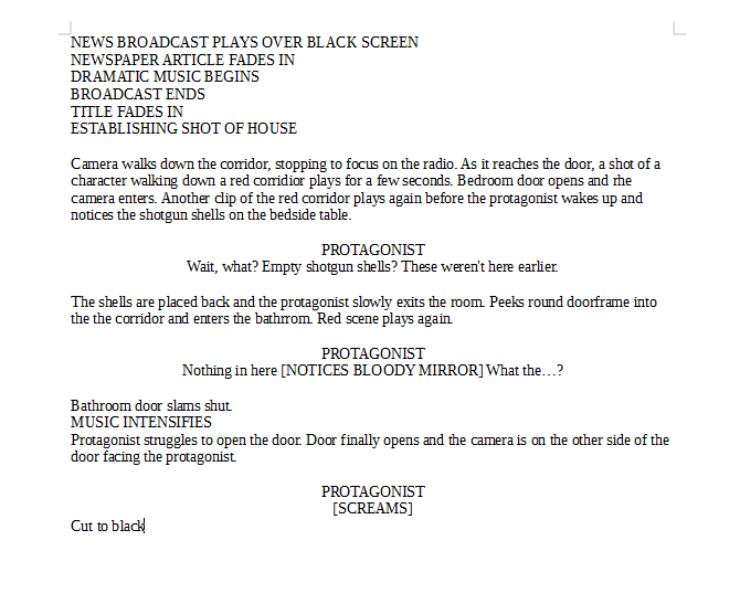
- A radio broadcast plays, detailing how a man murdered his wife and child.
- The camera then makes its way down the corridor, stopping to focus on the radio broadcast that is still playing.
- When the camera reaches the door, a brief sequence is played where a man can be seen walking down a corridor illuminated in red.
- The camera then enters the room, and the man seen in the 'red sequence' is asleep in bed.
- As he wakes up, he inspects some empty shotgun shells left on the bedside table, commenting on how they weren't there before.
- He walks out of the bedroom and enters the corridor, walking slowly as he is obviously disorientated.
- He notices the bathroom door is closed and struggles to open it, eventually entering,
- Once he's in he notices the blood on the mirror, and the door slams shut behind him.
- Again he struggles to open the door, with the camera cutting to be on the other side.
- The protagonist looks into the camera and emits a scream, before it cuts to black.
SHOOTING SCHEDULE
Session 1:
Didn't aim to get any filming done, but instead used it to get test shots and sort out basics, such as the set and costumes, as well as getting everyone familiar with the location.
Session 2:
This session is when shooting began. We felt that it would be easier to film our piece as close to chronological order as possible so as to prevent us from becoming confused with the piece and allow us to focus on the next scene faster. Therefore, this session is when we got the opening two shots filmed, with the camera entering the bedroom and the protagonist awakening, as well as him entering the corridor and doing the first 'loop'.
Session 3:
This session we got the next two scenes filmed, as well as the original establishing shot of the house with the full moon hanging over it. The scenes we filmed were when the protagonist first investigates the bathroom, as well as the 'red scene' that follows. The red scene took a little longer to set up, as we had to position the lights and take several camera tests to see how even the lighting was, and how it would be picked up on camera.
Session 4:
This is the first session in which we began filming our revised piece. We had originally planned to film the ending using this session, but instead implemented some stationary shots using a tripod to be edited in to the scenes already filmed.
Session 5:
This was our final session of shooting, and we exclusively used it to film the ending of the piece, taking place almost exclusively in the bathroom. We had to spend a while figuring out how to fit both the camera and Boris in the relatively small bathroom at the same time, as well as having the final shot look convincing enough to achieve its desired effect.
EVALUATIVE QUESTIONS
What media institution might distribute your media product and why?
Who would be the audience for your media product?
Click for the Prezi answering this question
Looking back at your preliminary task, what do you feel you have learnt in the progression from it to the full product?
Click for the Prezi answering this question
Looking back at your preliminary task, what do you feel you have learnt in the progression from it to the full product?
What have you learnt about technologies from the process of constructing this product?
How did you attract/address your audience?
Click for the Prezi answering this question
How does your media product represent particular social groups?
How does your media product represent particular social groups?
In what ways does your media product use, develop or challenge forms and conventions of real media products?
